


 |
| I have took this image of my Doc Martins because I need to fill in gaps on my magazine and I feel that they would fit in with the genre. |
 |
| I have took this image of my Doc Martins because I need to fill in gaps on my magazine and I feel that they would fit in with the genre. |
 |
| I have took this image of my Doc Martins because I need to fill in gaps on my magazine and I feel that they would fit in with the genre. |
 |
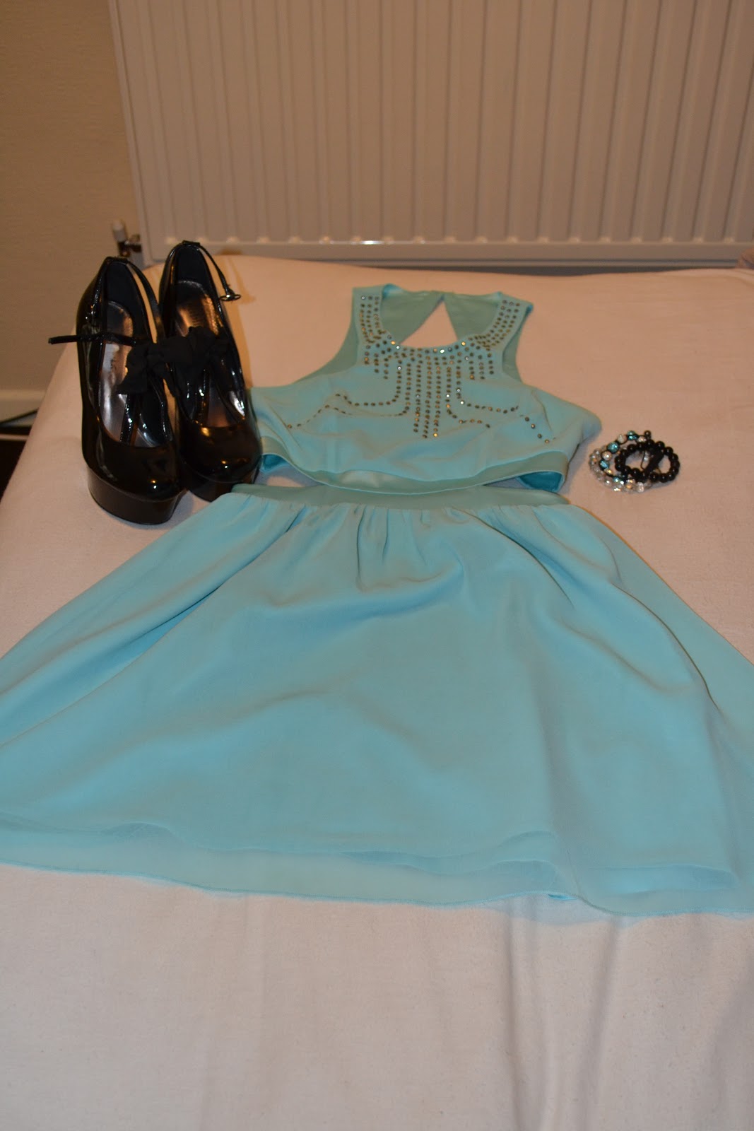
| I have took this image of my sandles because I need to fill in gaps on my magazine and I feel that they would fit in with the genre. |




 |
| Today I did not really do anything to my contents page because I have concentrated more on getting my double page spread finished. |
 |
| Today I did not really do anything to my front cover because I have concentrated more on getting my double page spread finished. |
 |
| Today to my double page spread I have changed the main title to make it smaller and then i have made a quote as the main title, because this will make my magazine look more pop. I have also changed the colour of the questions to pink because it now stands out from the answers. |
 |
| Today i have not really done a lot to my front cover because i have concentrated more on my contents page and my double page spread. Although I have added the information for the competition and also added boxes behind text to make the text stand out and to also give the page more colour and to make the page look more busy, because that is what pop magazines are supposed to be like. |
 |
| Today to my double page spread i have added the interview article, i have also added the two page numbers, i have done them in two different colours to give the page more colour, also to make it different. I have also added a circle for her Twitter and Facebook information to go. |
 |
| Today to my contents page I have added more text and also added boxes to make the text stand out and to also make the page look more busy. I have also added two page numbers for my double page spread vanessa may interview, because i have previously only put one forgetting it is a double page spread. The page numbers are now all in different colours, to give the page more colour and to make it look more like a pop magazine. I am also now looking at changing the image on this page because this model is on all three pages, and she looks to different on this page because of the way she has been edited also she is wearing the same clothes on them all, so I am thinking about changing her to a different model, or using the same model and taking a picture of her in different clothes. |
 |
| Today to my front cover I have more text, with boxes, I have also added the competition image, with the competition information. I have also added the publishing statement with the issue nymber and the date that is will be released, also the price it will be. I have also re-edited the image of my model because she previously had a pink outline around her face, also i believe she now stands out more. |
 |
| Today i have not really done anything on my contents page I have concentrated more on my front cover and my double page spread. |

 |
| Today i have really concentrated on my contents page. I have added the text to go with the image of my model. I have added a cirle behind this and also a white box around the main bit of text at the top. I have done this so that these pieces of information stand out and also so the main bit of text does not get mixed in with the text underneith it. I have also added an edited picture of some manicure nail varnishes with text to match. |
 |
| Today to my front cover i have added a white outline to the bold text along the bottom. I have done this because I think it now stands out more and also makes the page look more busy. I have edited the image of the purfumes and added them on. Then i have added the text to go with the purfumes. |
 |
| Today I have added the edited image of the nail varnishes to my front cover, I have also added the bar code. |
 |
| Today I have edited the nail varnish image for my front cover. |
 |
| Today I have also edited the nail varnish image for my contents page. |
 |
| Today to my contents page i have added the page numbers I have also made the background pink to match the front cover. So they can be identified from the same magazine. I have made the masthead big and bold and a different colour so that it really stands out. I have also added the text next to the image, I have something very similar to this on my front cover. This keeps the relationand makes the magazine look more like a pop magazine. |
 |
| Today I have started my front cover, I have edited the image and added it to the front cover, I hyave made it large so that it stands out because it should be the first thing you see when looking at a pop magazine. I have made the background pink, to make it look more girlie also because most magazine have a colour as their background and I think pink works the best with my type. I have added the masthead making it deep pink and rather large so that it stands out. I have also added big bold text along the bottom with love hearts to make it look more pop and to fill up space to make it look busy because that is how a pop magazine should be. |


