Here I am comparing my music magazine to a very similar magazine Top Of The Pops, showing how I have used elements from this magazine ( Use ), how I have used it but made it different ( Develop) and how I have used something totally different ( Challenge ).
Front Cover
1.
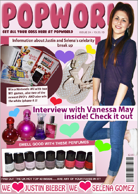
Use - Here I have copied using the word pop in my masthead from the pop magazine Top of the pops. I have done this because it simply shows the reader and audience what the genre of the music magazine is.
2. Develop - Here I have shown this as a develop because it is showing that we have both used a lot of images but I have made it different by using more images because I wanted to fill up that space to make it more packed like a pop magazine should be.
3. Challenge - Here I have a different colour of background. Top of the pops have a plain white background where as I have used a gradient to make it pink from white so it does not look plain, it also fits with my colour scheme.
4. Develop - Here I have used the way that this magazine has advised people how they
can look better. I have changed it by not advising them to look better
but to smell better. This is advertising the perfume and also making the
audience feel they can make themselves more attractive.
5. Use - Here both magazines have the main cover line as the next biggest size after the masthead. I have chose to do this so that the famous name of the pop singer will stand out and attract the audience to buy the music magazine.
6. Use - Here the bar-codes are in the same place with the price of the magazine next to the bar-code. There is a bit of a difference because the issue number on top of the pops is next to the bar-code where as on my magazine Popworld the issue number is under the masthead.
7. Use -Here I am showing the way that both of the magazines use the same colour scheme of pinks. The mastheads are the brightest of the pinks. I have copied this because I think it works really well with the genre and stands out like a masthead should.
8. Develop - Here I am showing how both of the models are dressed up with make up and dangle earrings , with there hair down nicely. There is a bit of a difference here because the model on the top of the pops clothing is more fancy and glamorous I didn't want this for my model as you can see she is dressed casually with jeans and a nice collar top. I wanted her to look casual so the audience will feel that they can look as nice as her even by dressing casual.
9. Challenge - The model on top of the pops takes up most of the front cover where as on my magazine I have chosen to not make my model take up a lot of the front cover, she still stands out without having to take up all the the page. Also the shot taken of the model for the top of the pops magazine is a medium long, concentrating more on her upper half. I have chosen to do mine differently and take a long shot of my model showing her whole outfit, because I felt her whole outfit fitted in with the pop genre and I feel the way she is positioned is good and different.
10. Use - Here I have chosen to highlight that both top of the pops and pop world have used quite a lot of boxes around their pictures and text. I chosen to copy and use this because it makes the page look more packed which is what a pop magazine should look like. It also has been used to make important things stand out for example on pop world the information about the competition has been made purple and then put in a white box to make it stand out to the audience.
Contents Page
1. Use - Here I have highlighted that my magazine and top of the pops have both used images of jewellry and make up accessories, I chose to do the same because I needed to fill some space and I felt that this was the best thing to use because it fits in with the pop genre.
2. Develop - Here I have identified that both magazines have big bold page numbers, I have made my magazines different. I have made my page numbers stand out more by doing them different bright colours and then putting them in a bright coloured love heart making sure that the number stands out over the love heart.
3. Use - As you can see there is two 3 boxes this is because the same thing has been used in two places. Both top of the pops and pop world have used 'We love .....' I chose to copy this because I liked the way they had done it and I felt it would make my magazine better and fit more with the pop genre.
4. Develop - Here I have shown that both magazines have again used the colour pink. We have both done this but used different shades of pink, top of the pops is brighter than popworld, I chose a duller pink because I wanted the other things on the page such as the images and the text to stand out more than the boxes and welcome.
5. Challenge - I have noticed that top of the pops have a lot of white spaces on the contents page where as popworld doesn't, I chose to make my magazine different by filling in the gaps with love hearts of different sizes and colours. I did this because I felt this made my magazine look more busy making it look more pop. It also attracts the target audience because it makes the magazine more girly.
6. Use - Here I have shown that both top of the pops and popworld have used boxes and shapes behind there text and images. I chose to copy this because I felt that it worked really well with the pop genre and could make my magazine better.
7. Challenge - I have pointed out that both magazines have a main image of a celebrity on the contents page. But my magazine, popworld, has more images, I chose to do this because I did not feel that top of the pops filled there space very well it does not look as packed as popworld. I feel that my magazine looks more pop because of the business.
Double Page Spread
1. Use - Here I am showing how both magazines have the main image taking up one of the A4 sides of the double page spread. I chose to copy this because I feel like the image is the main thing about the double page spread because it allowed the audience to know what the page is going to contain. Even though these are both images from a pop magazine my image looks more like pop because it is smiley, bright and happy.
2. Challenge - I have noticed that even though these are both pop magazines which are meant to be aimed at girls, the colours on the top of the pops double page spread are blues which you would associate with boys, where as on my magazine I have used really feminine colours like pink and purple. I chose not to copy the blues because I don't feel this relates to pop in any way, there is not even any sign of other bright colours to brighten the page up, where as my magazine is very colourful which I prefer.
3. Develop - For both magazines we have used an interview for our articles. I chose to do this because introducing a new pop singer I think should start with a interview to get the audience used the the person. We have done it differently because the top of the pops interview is rather negative, where as my interview isn't, mine is positive, which is what a pop magazine should be like.
4. Develop - Top of the pops have their page numbers in the centre of the A4 page and not in bright colours. Where as on my magazine they are in the corner all bright and they stand out. I chose to do this because I feel that pop magazines should really stand out and catch the audiences eye by using bright colours I believe my magazine has done this.
5. Use - Here
I have pointed out that both magazines have used columns, even though top of the pops has columns of text on both A4 pages and mine doesn't they are still the same in this way.
6. Use - Here I am showing how both magazines have used boxes and shaped behind their text. I chose to do this because it makes things stand out and makes the page look more packed and it also looks good on this top of the pops double page spread so I copied it.
7. Challenge - I have noticed that on top of the pops they have quite a bit of space between the images of text, I did not like the look of this when it is meant to be a pop magazine so I did it differently. I added girly love hearts to the spaces making it more packed making it more pop.


